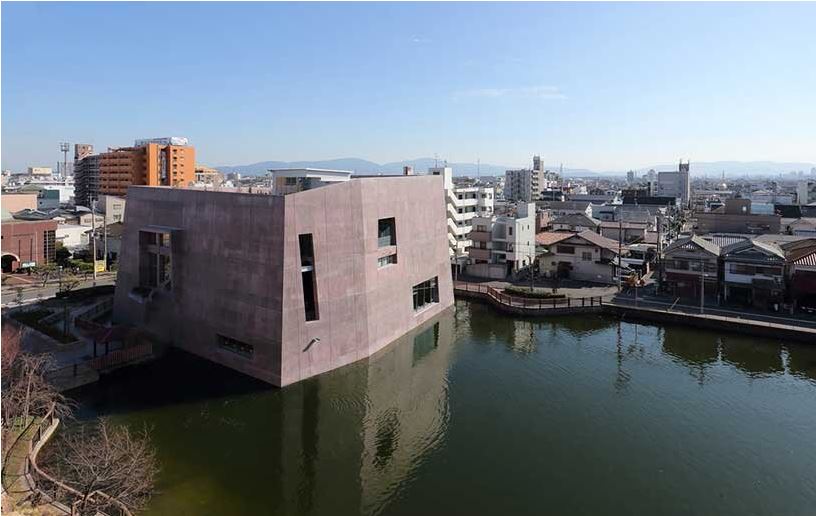
Maru Architecture has revitalized the central library of Matsubara in Osaka prefecture, Japan, by adding a monolithic extension floating on a serene pond. Modeled on a historical Japanese tumulus surrounded by large burial mounds and moats, the library, which is also known as the ‘Forest of Reading’, encourages locals to enjoy peaceful moments of solitude, studying, and learning. The project has received the 2020 Osaka Environmentally Friendly Architecture award and the 2020 Good Design Award.
The project seeks to highlight the character of the site, while ensuring a successful future for the library. Situated within the reservoir, the new extension takes shape as a burial mound itself, floating on the water without dominating the pond. To align with the architectural concept of the ancient tumulus, the design employs a structural system with a 600mm thick concrete external wall and an inner steel floor framing. Colored in pink, the thick exterior walls offer heat insulation, durability and strength, generating an earthquake-resistant building with a comfortable interior.
The library extension features large openings to promote sufficient illumination and ventilation for an optimal reading environment. In addition, the surrounding water body further contributes to natural ventilation through an evaporative cooling effect, while allowing the transition of time to be carried into the interior through daylight reflection. One of the major concerns for this building on the water was cracking of the exterior wall due to drying shrinkage. To prevent this, Maru Architecture adopted a crack control steel bar method, inducing fractures at the crack-inducing joints to prevent wall-surface fissures from being generated in other parts.
The lighting design creates varying impressions for each area of the library, while highlighting the outer concrete wall with cove lighting. Glare-less downlights with batwing light distribution are arranged according to the position of bookshelves to maximize vertical illumination on the books. Facing the atrium, the reading corner on the mezzanine is designed with spotlights installed in the gaps of the metal mesh ceiling. In the children’s open-shelf area, the downlights are finished with three different colors of white, pink, and gold, forming a vibrant, fun atmosphere.
YAKETY YAK Furniture Blog, mostly about cool libraries, furniture and design – keeping you abreast of our world. (Source: Designboom).


